
Paula Scher NYC Graphics
Paula Scher graduated with a Bachelor of Fine Arts at the Tyler School of Art in Pennsylvania in 1970. She excelled at illustrating with type and learnt that it had meaning and spirit. She moved to New York City to work and has become one the cities most iconic designers. Steer has lectured and exhibited world wide and has hundreds of international design awards. This includes teaching for two decades at the School of Visual Arts.
Her first serious work came out of the fact that she despised ‘Helvetica’ and thought it to be the cleanest, most boring,fascistic and repressive typeface. She was working at Atlantic Records designing one hundred and fifty album covers a year. She researched a lot of the old fonts in books and incorporated them into her work. Scher has a serious at play attitude and her work has a rebellious subversive feel to it, never perfect. She continues to break down barriers.
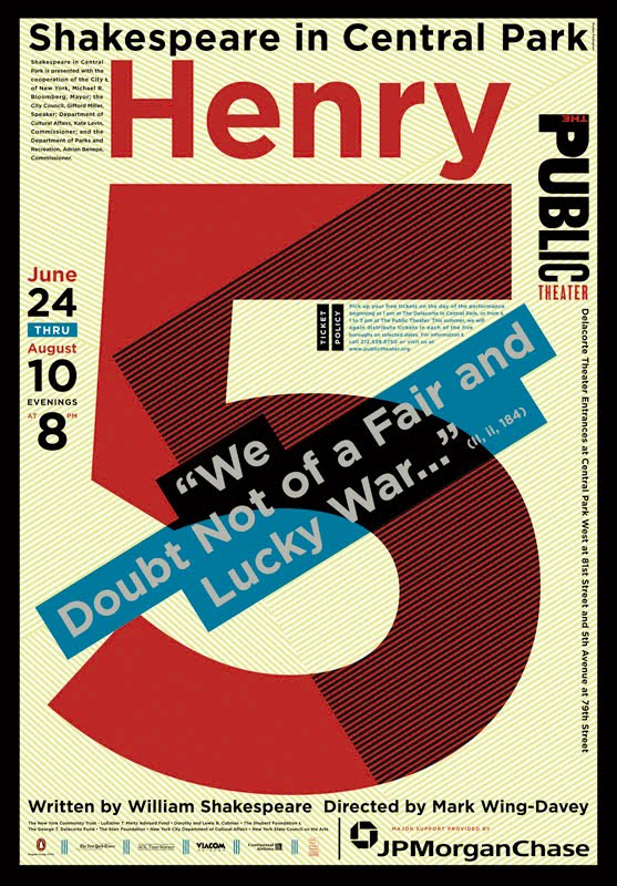
Public Theatre Graphics in the nineties
Some of her most inspired work was done when she was working for the Public Theatre where she pushed boundaries yet again using flat colours with silhouetted graphics and typography that is meant to make noise. Her use of typography incorporated into architecture on the inside and outside of buildings was ground breaking.
Creating Art installations as landmarks
A town called Northside in Pennsylvania commissioned her to do a logo to attract more people to their part of Pittsburg. There were several a grim underpasses and bridges between the two sides of town so she suggested instead of doing a logo that they make the these into art installations and it would act as a landmark to draw people across town.
Scher was the first female principle at design agency Pentagram with offices around the world. Some of her logo work includes Citibank, the New York Ballet, CNN, Windows 8, Tiffany & Co, Moma and Ted Talk Paula Scher